Branding Campaign | Rocket Burger
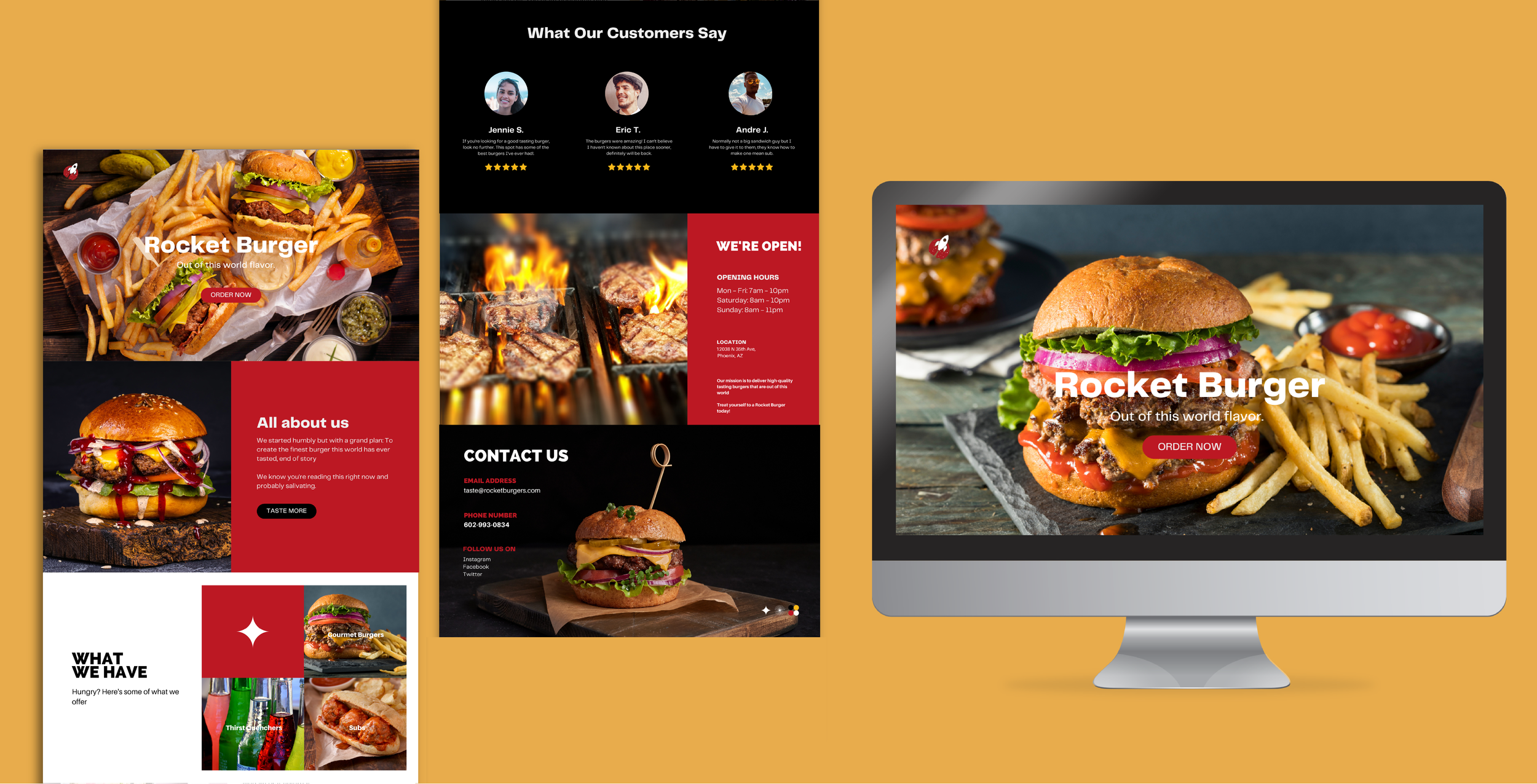
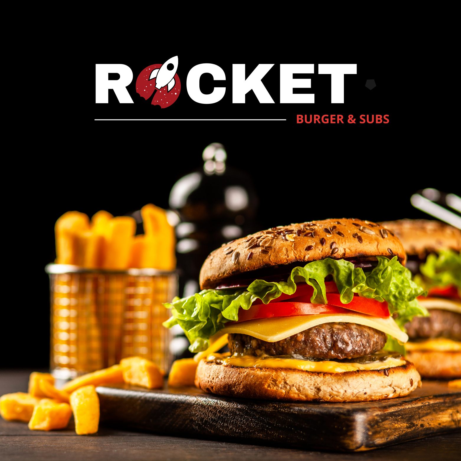
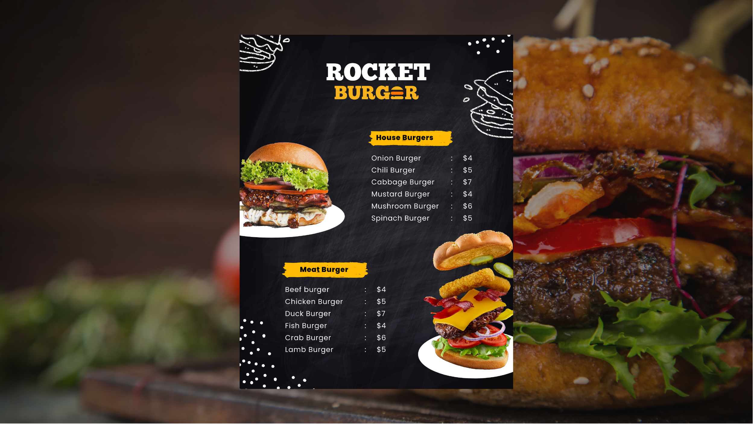
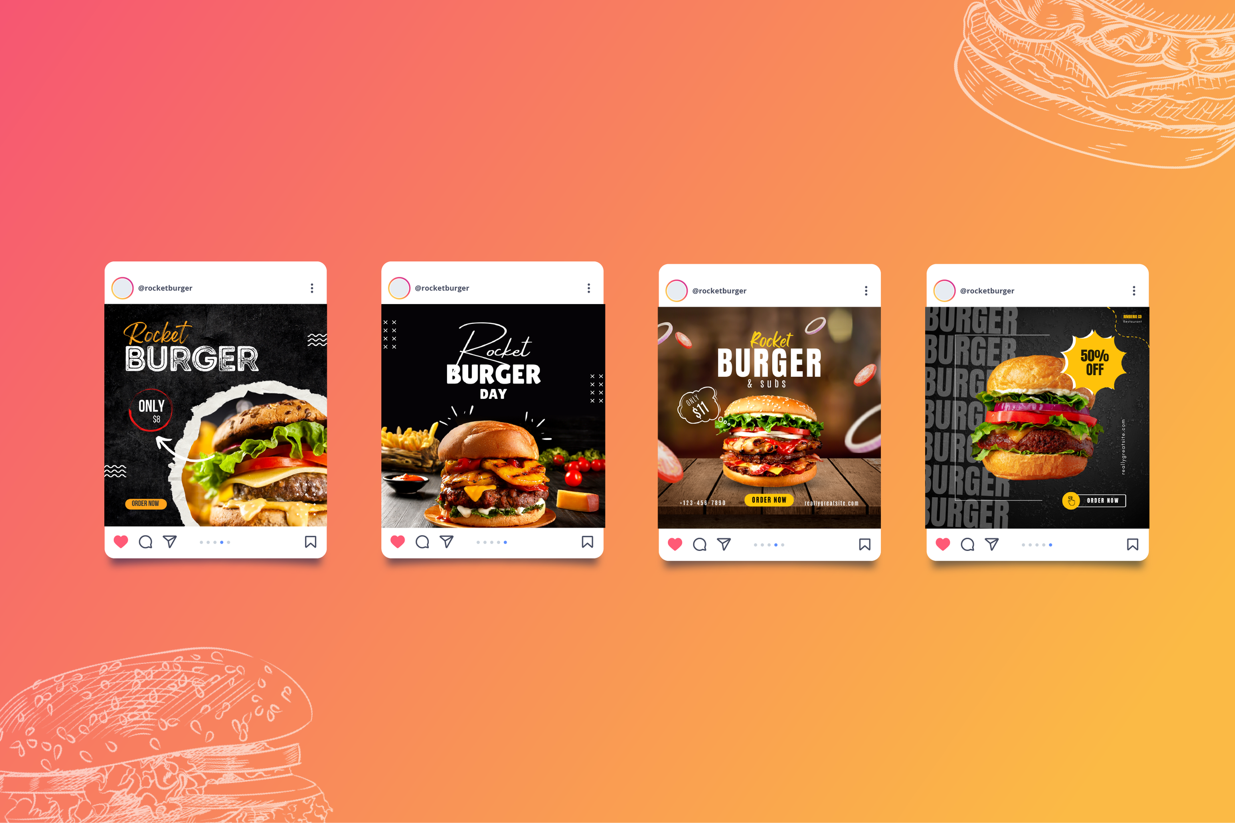
This project involved re-branding the current outdated feel of the restaurant to a more modernized look through the use of updated content and visuals.
Goals: To enhance and modernize their logo, website, menu, and social media in order to increase exposure, visibility, and engagement.
Challenges: Creating a unique and different appearance that still aligned with their existing brand identity
Colors: New color palette consists of red, tan/yellow, black, and white. These provide a nice contrast between each other and are colors that are associated with food or hunger.
End Result: Final output consisted of completely new website landing page, logo, and other branding assets that are cohesive and stay true to the already established restaurants identity.
Client
Rocket Burger
Location
Phoenix, Arizona
Year
March 2023





Mobile app Sign-in Screens | BLUSVN
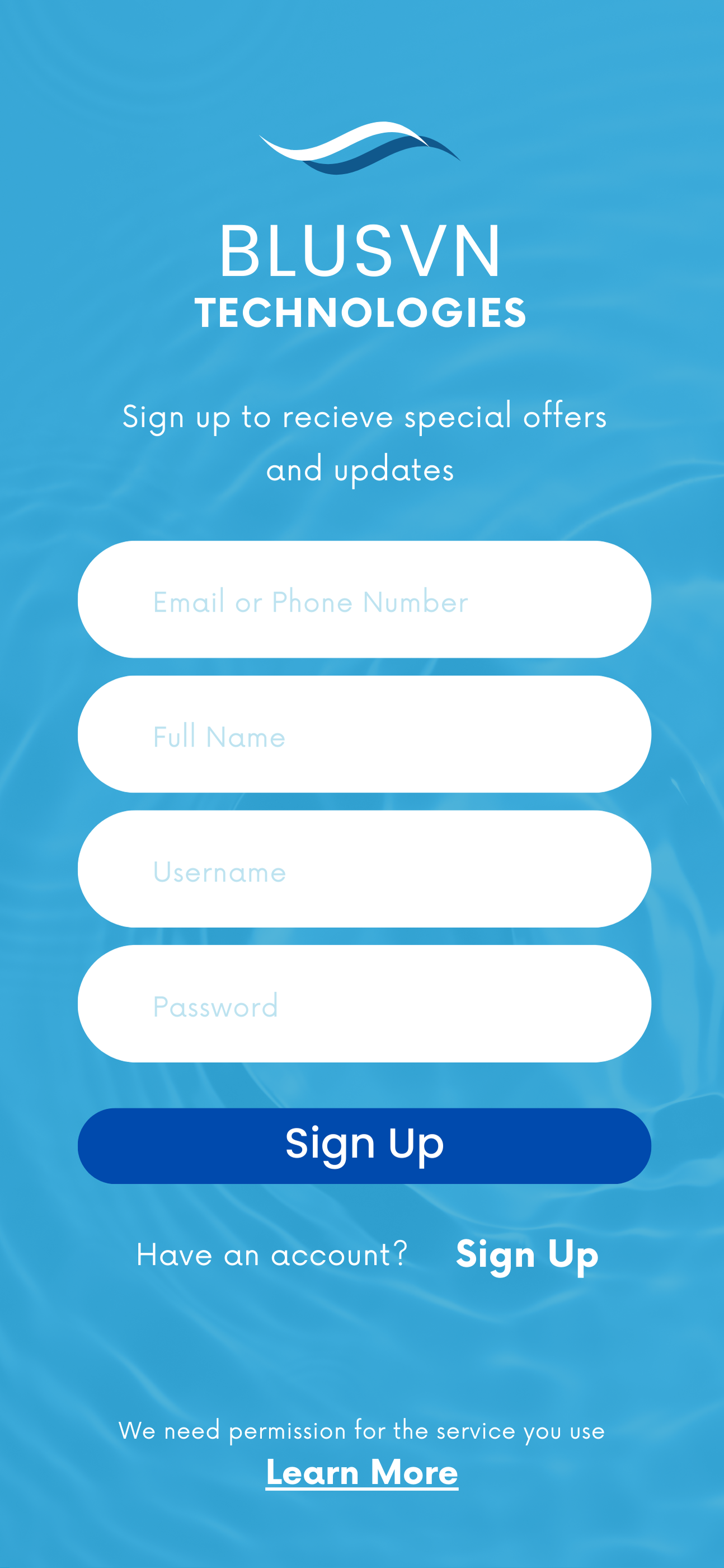
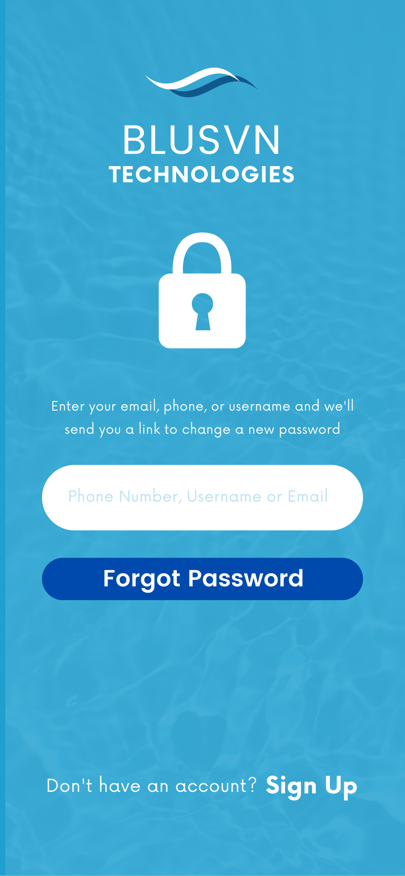
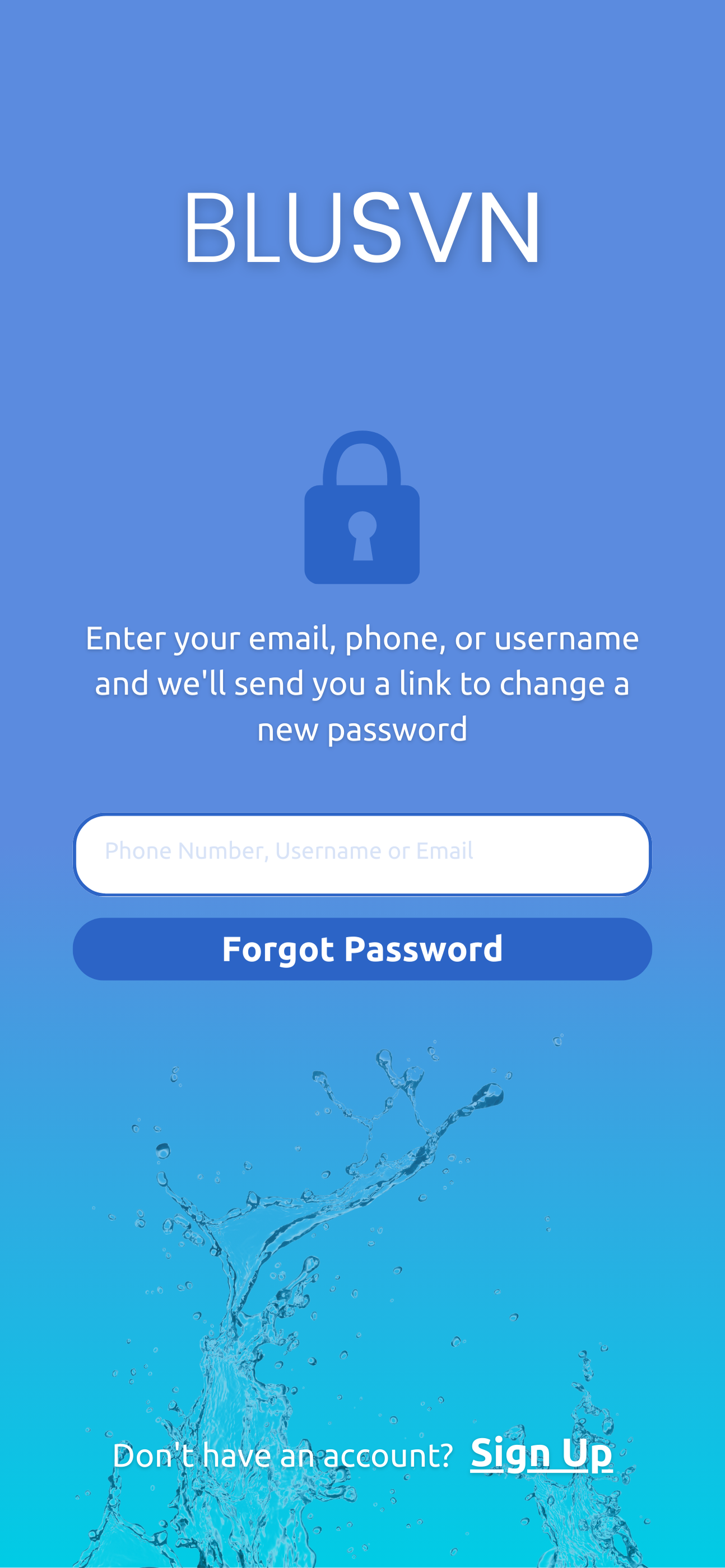
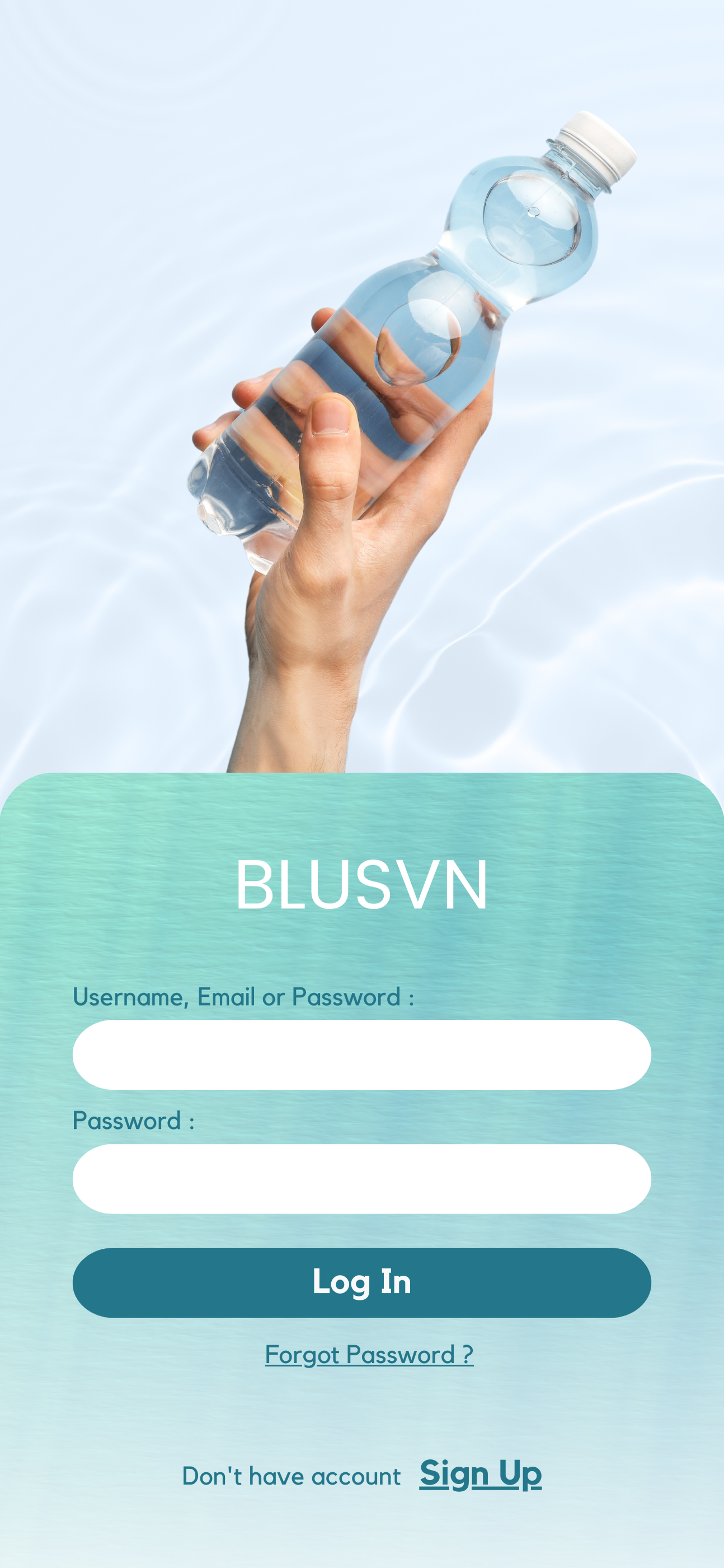
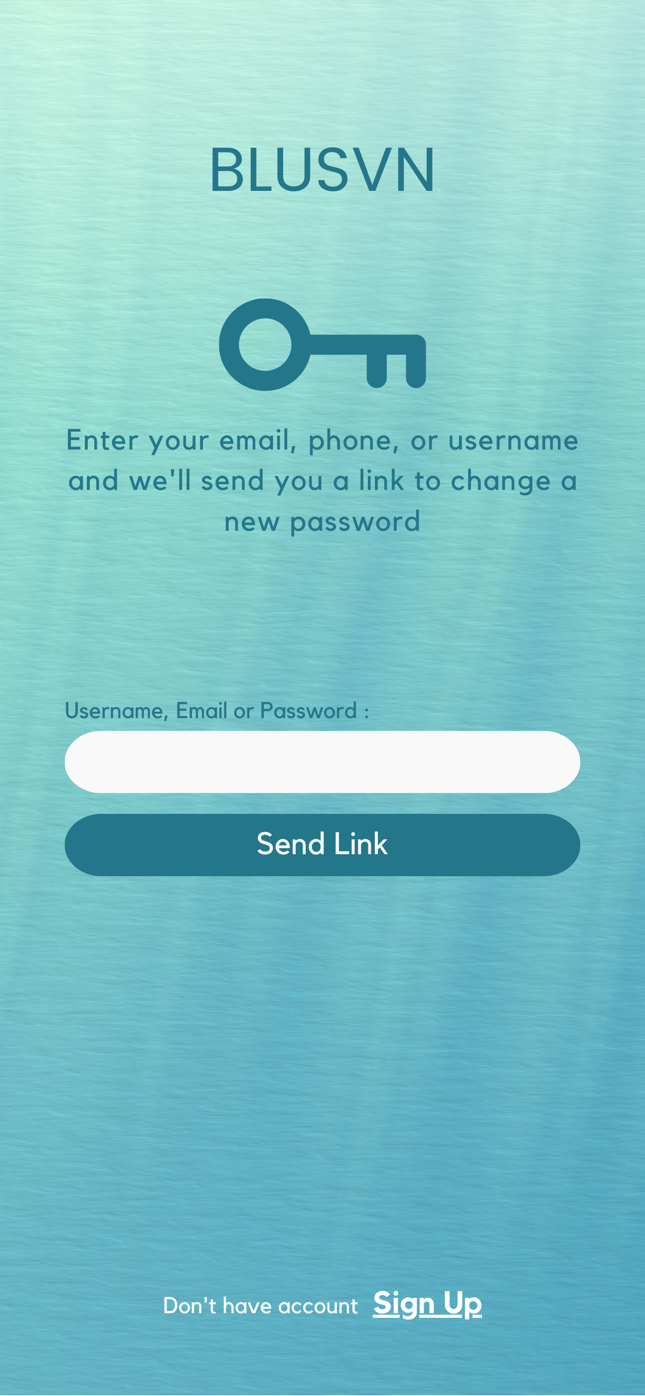
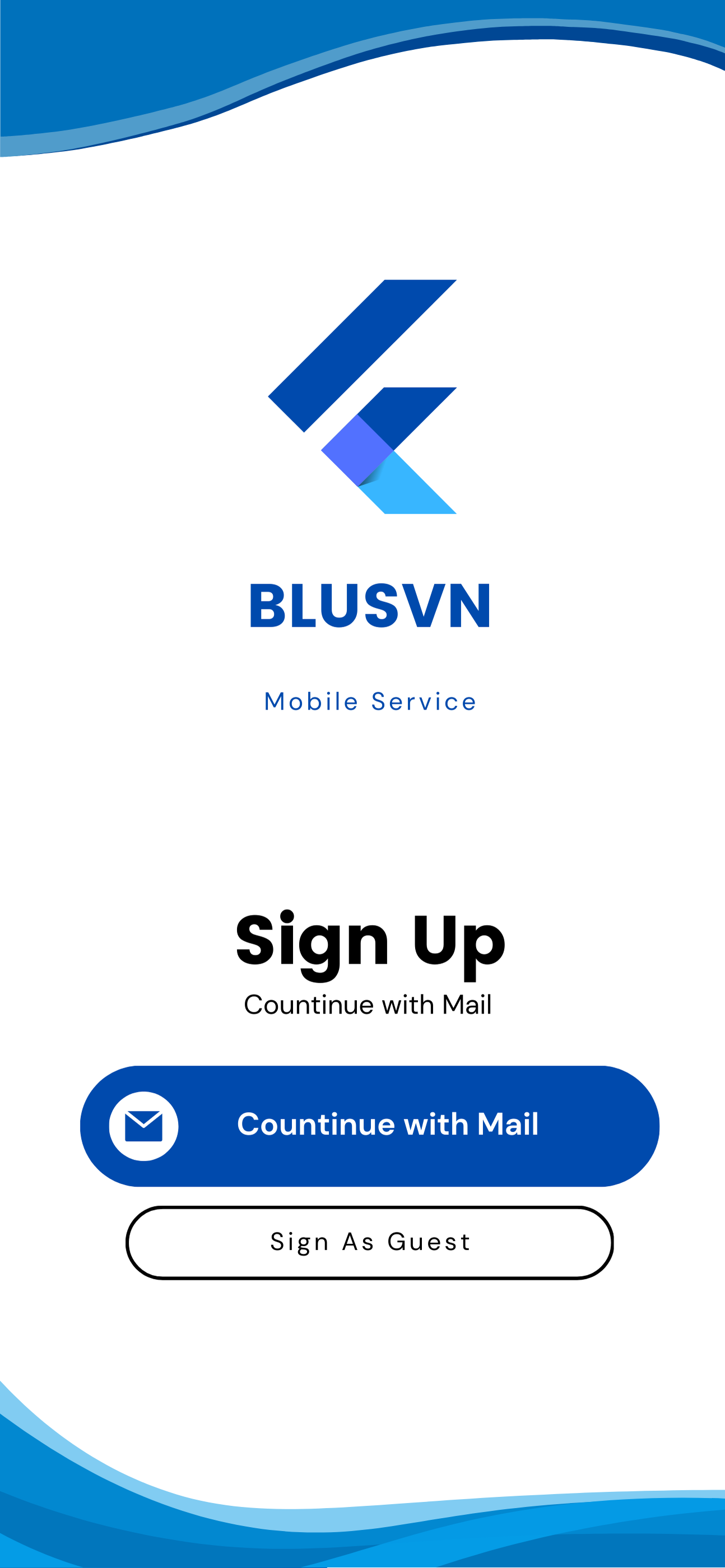
I designed multiple "sign-in" page mockups for BLUSVN's mobile app, each offering a unique take on user interaction and branding. The goal was to present diverse options that merge aesthetic appeal with seamless usability.
Process: Designing these mockups involved a thorough process of research, ideation, and iteration. I began by creating wireframes to map out different layout structures, focusing on simplicity and user accessibility. I then experimented with various font choices, color combinations, and branding elements to ensure the designs aligned with BLUSVN’s visual identity.
Challenges: A challenge that I faced included balancing a clean, minimalist design with the need for clear visual hierarchy and functionality. Ensuring that the interface was intuitive across the board.
End Result: Overall, these mockups provide BLUSVN with a solid foundation to launch a visually cohesive and efficient mobile app. Each mockup presents a distinct approach, allowing BLUSVN to choose from options that align with their brand while ensuring an intuitive user experience.
Client
BLUSVN
Location
Scottsdale, Arizona
Year
2024





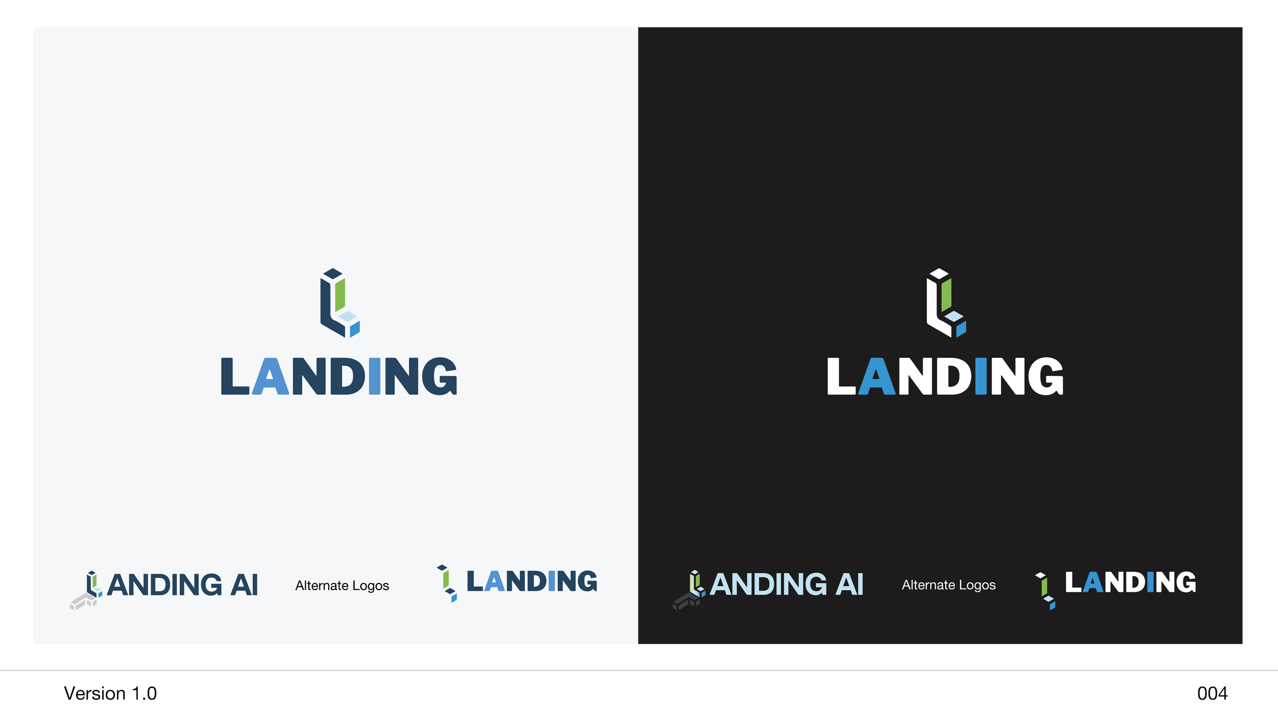
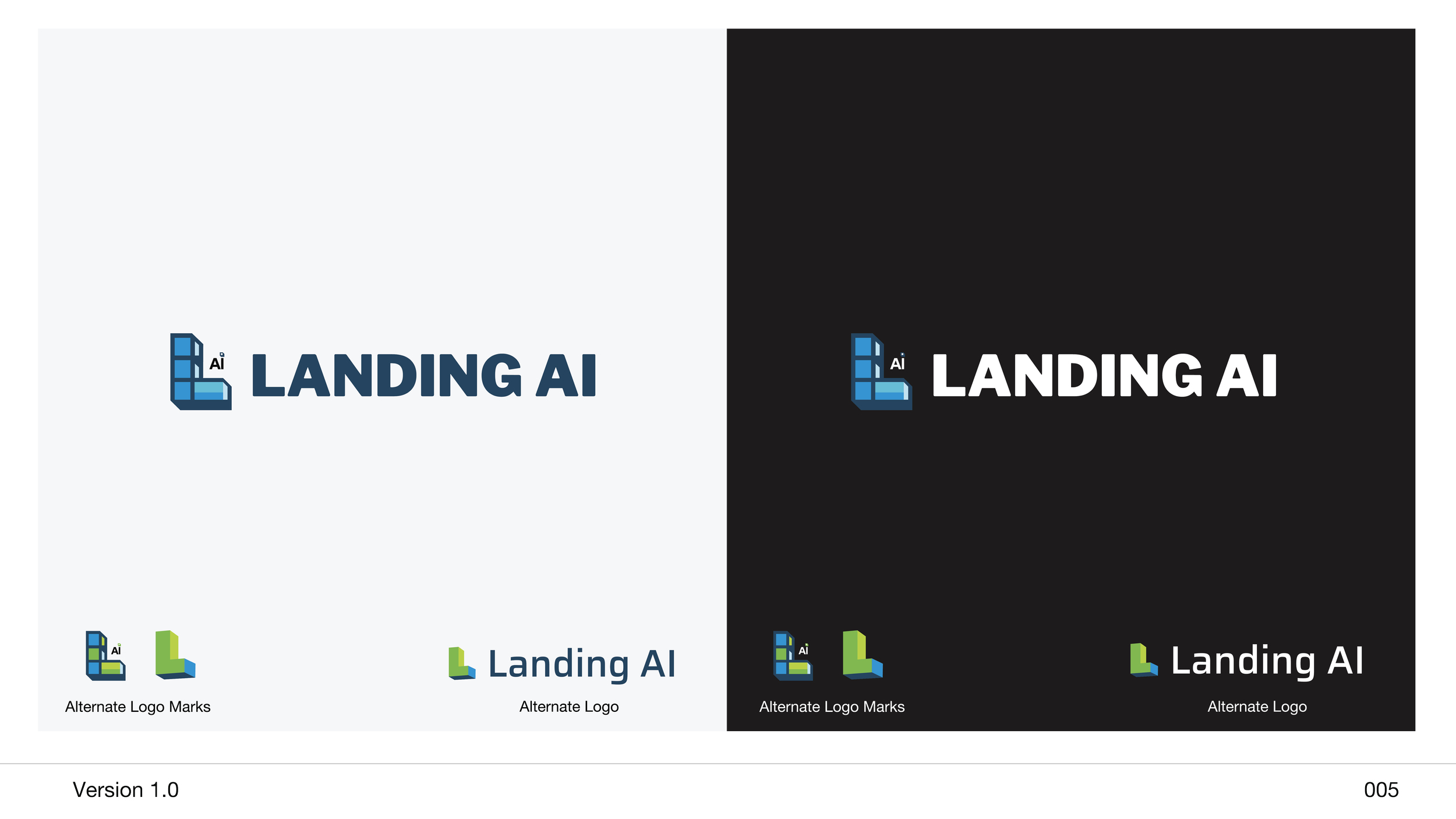
Logo re-design project | Landing AI
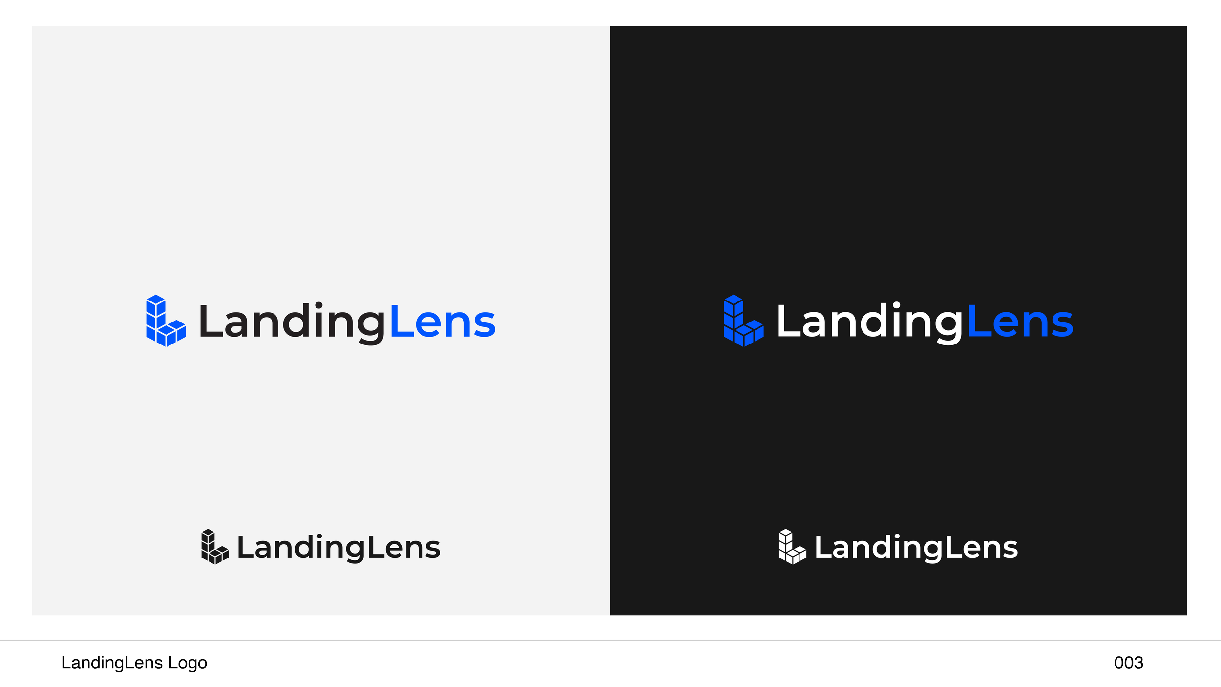
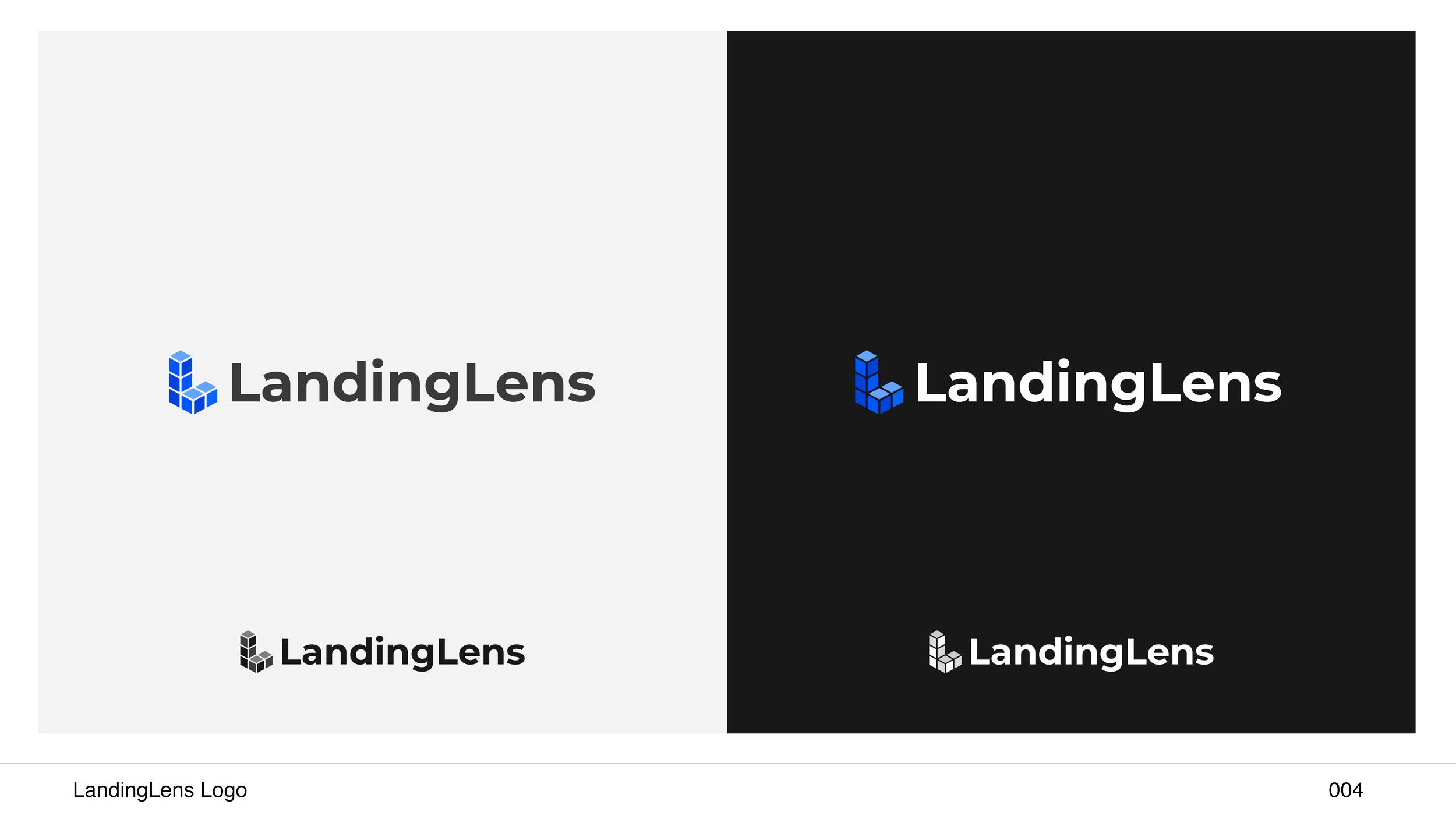
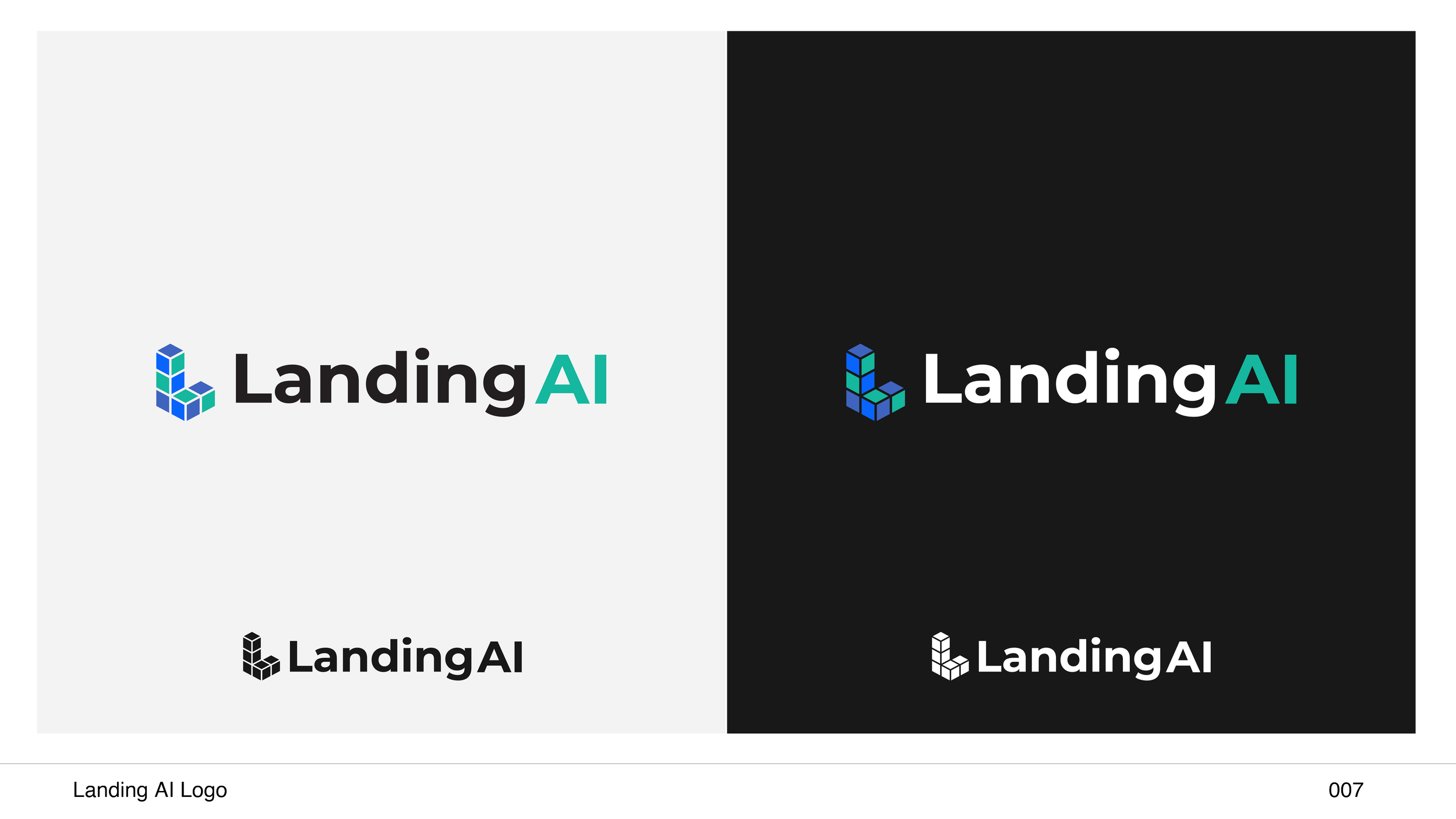
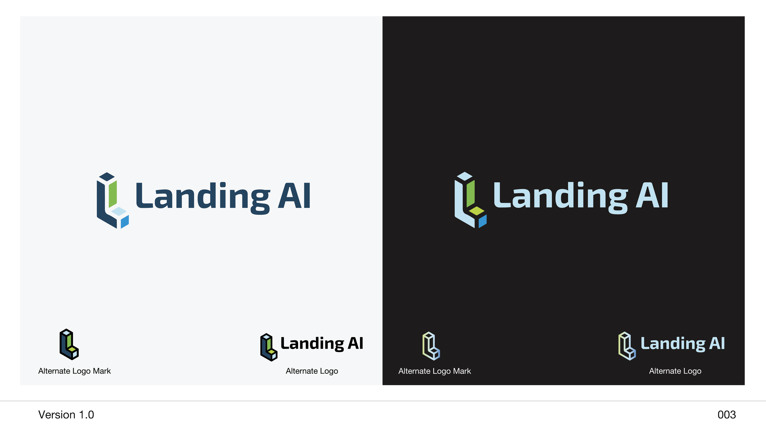
To redesign the logo for both LandingLens and Landing AI, I worked in a collaborative design team that emphasized creativity and strategic thinking. We began by conducting thorough research into the company's brand identity, target audience, and competitors to ensure the new design would be both distinctive and relevant.
Process: We had multiple brainstorming sessions where we explored various concepts, color schemes, and typography options. We used mood boards and sketches to visualize potential directions, incorporating feedback from key stakeholders along the way.
Challenges: To refine our ideas, we created many mockups and conducted internal reviews to assess their effectiveness. Throughout the process, I ensured clear communication within the team and with the client, incorporating their input and making iterative adjustments to align with their vision.
End Result: The final design emerged from a series of collaborative workshops and feedback loops, resulting in a modern, innovative logo that better represented Landing AI's and LandingLens cutting-edge technology and mission. The project highlighted our team’s ability to work cohesively and adaptively, ultimately delivering a logo that strengthened the company’s brand identity.
Client
Landing AI
Location
Palo Alto, California
Year
2024


